Writing Accessible Content in a Content Management System

Accessible Entry sign on brick wall

Accessibility isn’t just a concern for web developers. With content being dynamically created, there are a few points content editors can keep in mind to make sure their content is accessible to everyone. Following accessibility standards helps non-visual users, but can also help all users find and understand the information they’re looking for.


Creating Emphasis

One of the most common times accessibility issues pop up is when content editors are trying to emphasize sections of text. It is important to keep in mind that screen readers do not recognize details like different colors or bolded text, but will intonate exclamation points. If it is vital to the understanding of the content that a certain sentence be highlighted, consider using an exclamation point. If it is not vital but may help visual users to better understand the message, your best bet is making use of bold. 

From a usability standpoint, be wary of using color for emphasis. Colors can have unintended implications, such as causing the user to think the text is a warning, or even a link. Text also has to pass a certain color contrast ratio with its background to maintain accessibility, so unless a designer or developer with a knowledge of accessibility has picked out new colors for you, it’s best not to introduce more.

Another common mistake when emphasizing content is using all uppercase letters. A screen reader will read this out like an acronym, which could be particularly painful for a full sentence. Aside from screen readers, it is also shown to be less readable for all users when there are more than one or two words in a row in all-caps. Sometimes you’ll see all-caps used on buttons or labels, but the crucial difference is that these are (or should be) made into all-caps with code. A screen reader will usually ignore the css and see the text as it is originally written.

Is bold not enough variation for your content? Talk to your designer or developer about coming up with additional text styles for you to use. You may think to yourself, “I already have a dropdown with five different text styles I can use!” What you’re probably referring to is the heading selector.

Dropdown heading selector menu in a Drupal toolbar.
Heading selector in a WYSIWYG field in Drupal.

Headings should never be used for emphasis or a stylistic choice. They are a tool to add structure to a page.


Heading Structure

Headings are pieces of HTML that are used to give structure to a page. They make it possible for non-visual users to navigate and understand a page without needing to see visual indicators. There is a specific way headings need to be arranged on a page. 

Headings are nested, just like you would see in an outline of a paper where subsections are indented and have a different bullet point or character. Heading 1 is the topmost level, functioning as the title of the page. There should only ever be one H1 on a page, and if you’re using Drupal or any other content management system, the H1 is probably already generated for you as the page title. If you’re working in a body field, for example, you’ll most likely start with H2 to title a section of content. Anything else at this same section level will also be an H2. If you need to label sections within this section, you can start to use H3’s. If you need to go any deeper than this, you can start to use H4’s, H5’s, and H6’s, but if you are going this deep into the structure, it may become difficult to follow for your average user. Here’s an example of heading structure:

(H1) The Most Amazing Chocolate Cake

          (H2) My Grandmother’s History

          (H2) Ingredients

                    (H3) Types of flour you can use

                    (H3)  Alternative ingredients

                              (H4) Vegan alternatives

                              (H4) Gluten free alternatives

          (H2) Instructions

                    (H3) The cake

                    (H3) The frosting

An important thing to watch out for is that heading levels don’t skip. You don’t want to go from an H2 right to an H4. That makes it more difficult for non-visual users to understand the structure of the page, and creates inconsistencies for all users. If you keep finding yourself tempted to do this for visual reasons, think about why it feels like the heading style available doesn’t fit, and work with your designer to figure out how best to fix it.

As mentioned before, don’t use headings simply to emphasize text. If you’re making a whole sentence into a heading, it’s probably not the right use. Headings are also not designed to be used for long sections of text. Bigger and bolder does not always mean easier to read. Sometimes a pull quote or a custom text style is an option that will accomplish what you’re looking for, without creating accessibility and usability issues, as well as design inconsistencies between different content editors.


Foreign Languages

Sometimes on your site you’ll need to add text in a different language. Visual users can identify when they won’t be able to read something, but screen readers need a hint that a sentence is in a different language. There’s a simple way to add this hint to your text: the language button. When you add content to a text field, usually you will have a toolbar at the top that allows you to make things bold, add a link, etc. One button that you may see if you’re using Drupal looks like this:

Language button selector in Drupal tool bar.
Language button on a WYSIWYG field in Drupal.

If you see this button, you can highlight your text and select from the dropdown. If you don’t see this button, or any buttons, ask your developer to make it available for that field.

Another thing to note with foreign languages is that users can use external tools to translate the content into a language they understand. For this reason, it is best to stay away from made up words that would only make sense in the language you’re writing, but not others (i.e. “hangry”).


Special Characters

One more content writing trend to avoid is replacing letters with characters, for example “$ave ₵ash” or “see u l8r.” This causes predictable issues for translation and screen readers, but it also can show up incorrectly for anyone. If you have an article titled “$ave ₵ash” it will show up in the url as something like this: yoursite.com/news/ave-ash, which could lead to some confusion when sharing links. The “u” in “see u l8r” would most likely be understood by a non-visual user, but would be impossible to translate.


Writing Accessible Links

Writing good link titles is important, and once you understand how non-visual users navigate a page, it’s easier to accomplish. These links could be inline links, such as a word in a sentence, or could stand alone, such as a button. Regardless, what you want is for link titles to be able to stand on their own. This is because one navigational tool that assistive technology provides users with is a list of links that appear on the page. Imagine a list of links that says “click here,” “learn more,” and “download.” These links don’t give the user any context or information about where the links will go. Instead, create links with text that gives users an understanding of what exactly that link will be doing. No user wants to waste time clicking on a link gives them an unexpected result.

W3.org gives these as examples of successful links (URI refers to the link destination):

A link contains text that gives a description of the information at that URI

A page contains the sentence "There was much bloodshed during the Medieval period of history." Where "Medieval period of history" is a link.

A link is preceded by a text description of the information at that URI

A page contains the sentence "Learn more about the Government of Ireland's Commission on Electronic Voting at Go Vote!" where "Go Vote!" is a link.


Meaningful link text also helps users tabbing through a page from link to link. Users can more easily navigate and determine where to go next without spending more time than wanted on an intermediary page.

Learn more about link accessibility at w3.org.


Writing Good Alternative (Alt) Text

Images that you add to your page need good alt text. When using a content management system, you’ll see a field show up when you add an image, asking for alt text. Alt text allows non-visual users to get the same basic information that the image is giving to a visual user. It is what shows if an image doesn’t load, whether because of a broken image link(?) or a user’s limited internet access. It also provides information to search engines.

Writing good alt text can feel a bit tricky at first. What you want is for your alt text to communicate the content and function of the image. Think of alt text as what you would want to appear in the place of the image if you couldn’t use it. You’ll want to be succinct in describing the image, and avoid any redundancy with the text around it. Screen readers will know that it’s an image, so don’t add text like “image of…” Think about what information is and isn’t helpful, and why you’re adding an image in the first place. Is it just to take up space next to text, or is there something important being conveyed through that image? An image of students on a quad conveys information about student life at the university, whereas a cartoon image of a backpack likely doesn’t add any information.

Required alternate text will have a red asterisk next to it.
Example of an alt text field in Drupal8.

Sometimes the alt attribute of an image should be empty. The alt attribute is the piece of HTML that is holding the alt text you enter when you first add an image. You may instead have a label below your image that is visible to all and acts as alt text. You wouldn’t want a screen reader to read out what would ultimately be the same text twice, so you’ll want an empty alt attribute on the image. The only instance where you want no alt text at all is when an image is only decorative, such as a swirling line between text sections or a generic image added only to break up the text (like the previous backpack example). Alternative text may be a required field when you add an image, in which case adding empty alt text by typing a single space in the field might work for you. If this doesn’t work, you may want to talk to a developer about making alt text optional. Consider how many content editors your site has, and if they all have accessibility training. If it is possible that a lot of images that need alt text could end up without it, it may be best to keep it required and minimize using images that don’t add meaning to a page. If the image has alt text in a caption already and you need to add something into the alt text field to be able to save it, try to add context that isn’t already clear from the caption. In most cases you will want alt text anyway, but ask yourself if the alt text you’re adding will be a help or an unnecessary hindrance to a non-visual user.

Wikipedia article with image captioned, "Horseback riders entering Redwood National Park."
Wikipedia shows the alt text below the image and the alt attribute stays empty.

When an image is linked, and is the only thing in the link, the alt text needs to describe the function of the link. This is because the link doesn’t have any other text in it, so any clue as to where the link is going to go is taken from the alt text. In this case, you can write alt text as if you were writing link text.

For some great examples of how to write alt text, take a look at the list provided by webaim.org.


Conclusion

Once you understand how different users are experiencing your content, writing with accessibility in mind starts to get easier. It’s not always the most exciting and creative part of writing content, but it can be a rewarding experience to continually remind yourself to think about users that often can be overlooked. Putting yourself in someone else’s shoes can help build empathy and make the web, and particularly your piece of it, a more positive space for all.


Creating a User-Centered Website

Child holding colorful crayons

In response to the COVID-19 pandemic, the Redfin Solutions team has shifted to working remotely. Because of the nature of the pandemic, some of our clients have tight deadlines in order to get information out to people as quickly as possible. A recent client with a special need for a quick turnaround is the Rural Aspirations Project, a non-profit in Maine committed to connecting parents and educators with resources, support, and networking opportunities provided by trusted local organizations. When the schools closed, parents and educators’ need for help grew exponentially. 

Rural Aspirations came to us with the idea for Community Learning for ME. The goal of this project was to create a tool for educators and families to find reliable resources specific to their needs. We knew that for this to be successful it was crucial to keep our focus on the user. At the same time, we had to finish the project within two weeks, including design and implementation, all while adjusting to the new normal of remote work.

User personas + User journeys

Our first step was to get acquainted with the user audiences. Luckily, those at Rural Aspirations are very connected with who their users are, as they work with them personally. In their documentation for the site, they had already included a mix of what we refer to as user personas and user journeys. These outline rough groups of people who will use the website, and the situation they might be in at that moment. 

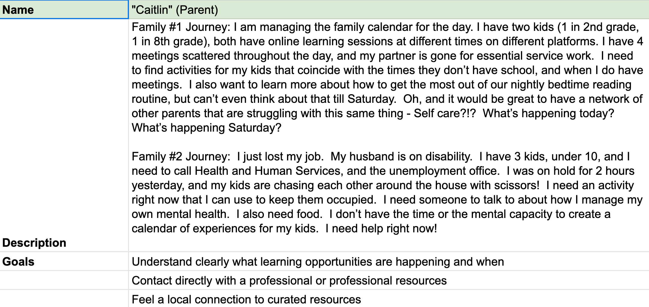
One of our user personas was Caitlin, a mom of two kids, one in second grade and one in eighth. Her partner is an essential service worker and she has a job where she has to be in meetings during the day. She is overwhelmed by work and childcare but wants to help her kids more. 

Each persona allows the Redfin team to understand a little bit more about one type of person that might be using the site including basic information, the challenges they face, and their goals. We also wanted to understand how they might be using the site – the user journey. For instance, when Caitlin uses this site she wants to get to content for her kids quickly (she may be minutes away from an important meeting) and not have to spend time figuring out if it’s safe and quality content. She would also benefit from discovering that there are resources to help her, in case she wanted to come back when she has some time.

Example of user persona


User flow

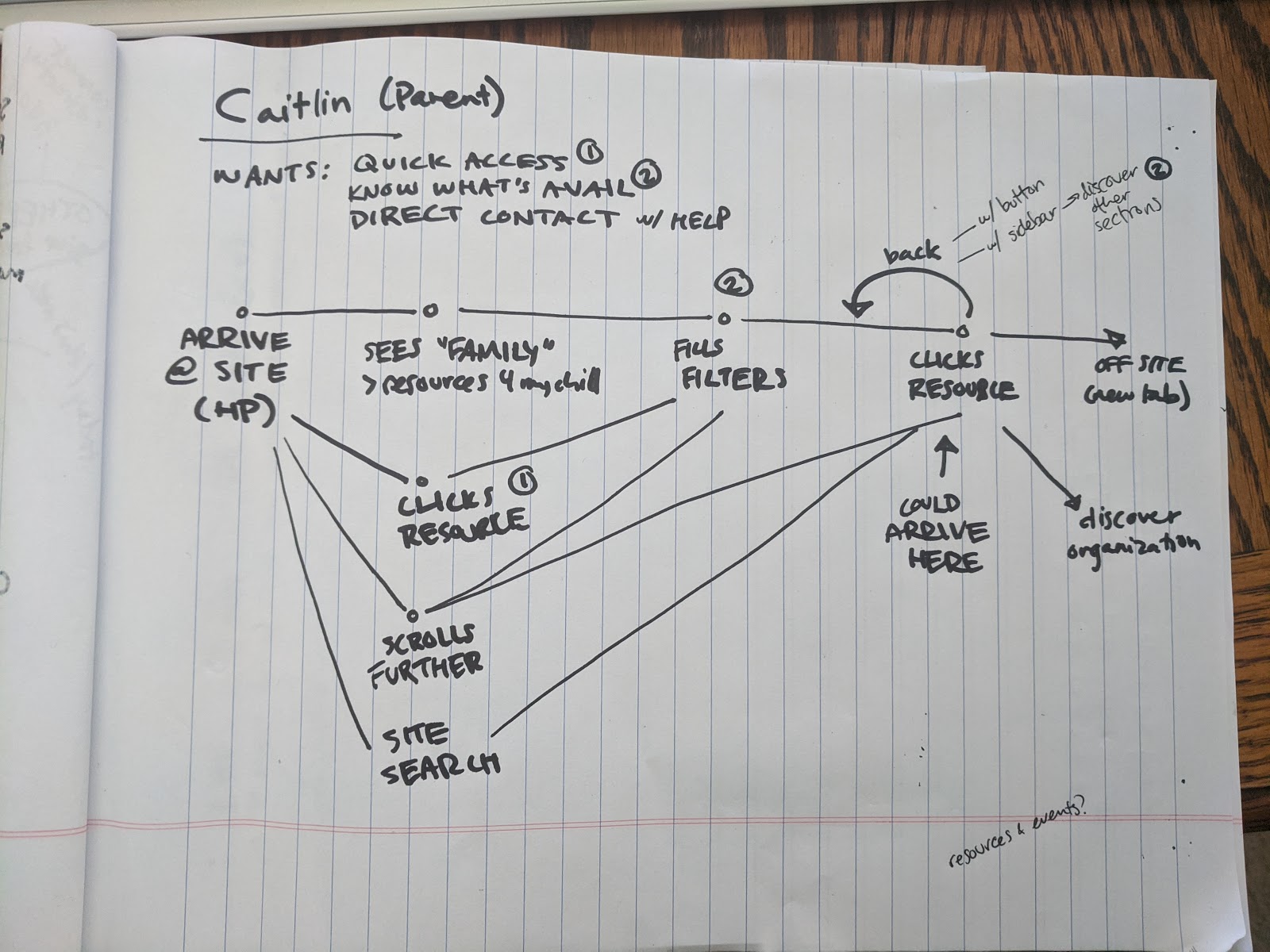
Once we started wireframing (the first step in the design process where we map out different pages the website will need), we decided we needed to look at the user flow. The main difference between a user journey and a user flow is that the user flow takes a closer look at how the user interacts with the product once they are on the website. We looked at the main entry points of the website: the homepage and an individual resource, taking into account the possibility of these resources being shared on social media. The challenge was to orient the user, and then create a balance of quick access and discovery. We provided several paths from the homepage to the end goal of finding a resource, and included those filterable resource landing pages as the primary links in the global navigation. From an individual resource, we provided a link back to the filter landing page in order to create a loop from the filtered page to the different resources until the user found the right one for them.

User journey map


Wireframes, annotated designs, and building in Drupal

One of the user personas that Redfin Solutions always anticipates is a content editor, so we kept the user experience in mind even while building the administrator side of the website. We used Drupal to create a content editor experience focused on clarity and ease-of-use, as well as automation, so that Rural Aspirations could focus less on updating the website and more on their jobs. We also gave contributing organizations the ability to add and update their own resources, making use of Drupal’s user permissions to limit them as needed.

One aspect of this project that made it successful was having key members of the team included in every step. We started meeting with our clients with a lead developer, a designer, and a project manager. Later in the building process we would involve others, but having both a design and technical architect from the beginning and throughout the entire project was crucial. It ensured we didn't waste time designing features that couldn’t be built in time, and that features were prioritized and adjusted based on the users’ needs.

The Redfin team was also able to test out some of our design processes and add new ones to make the most of remote collaboration. We used Invision to annotate and share designs, and we tried out Invision’s live whiteboard tool Freehand for the first time to create and share wireframes. Since we’re used to working together on a whiteboard at the office, this helped us to avoid designing in isolation and get quick feedback from each other.

Rural Aspirations’ main concern is helping people through this stressful and overwhelming time. As we worked on this project we realized the logic of sorting through these resources would be complex, but that its success would depend on making it all look simple, thus removing any extra stress from the user. With more time to spend on this project our next step would be to test the success of this tool with google analytics and live user testing, but for now we have created calls for feedback throughout the site. In times of crisis it is particularly important to focus on users first and building sites that relieve burdens.

Support the Drupal Association During Uncertain Times
Drupal Association logo with surf
Leslie Thu, 03/26/2020 - 10:59

First, I want to thank everyone in the Drupal community for all you have done in the past to support each other and the Drupal project. I was fortunate when I started my Drupal journey back in 2011 to have been introduced to and embraced by the Drupal community right from the start. I have met so many incredible people who I now consider friends. My life wouldn’t be what it is today without so many of you. Thanks to the awesome community for that.

As one of the community-elected members of the Drupal Association Board of Directors, I am reaching out to the Drupal community for your support.

Please start by taking a few minutes to read the recent post by Dries Buytaert (founder and project lead of Drupal) and the recent post by Heather Rocker (Executive Director of the Drupal Association) regarding the uncertain times which the Drupal Association faces with DrupalCon Minneapolis due to the COVID-19 pandemic. These posts explain why it is so important for folks to step up now and help support the Drupal Association.

So how can the Drupal Community help?

What can an organization do?

  • Join the DA’s Supporting Partner Program.
  • Join other leading sponsors in committing your DrupalCon Minneapolis sponsorship funds regardless of the outcome of the current crisis by email sponsor@association.drupal.org.
  • Make a Charitable donation.

What can an individual do?

What can everyone do?

  • Reach out to companies and organizations that you support that depend on Drupal and encourage them to join the Drupal Association as a Supporting Partner or to make a Donation. So many great organizations depend on Drupal for their websites and functionality, yet do not know that the Drupal Association exists or understand why supporting the DA is so important to the Drupal project.  (Template to potentially be used as a starting point for your email)
  • Reach out to those in your local Drupal communities to encourage folks to learn about how the Drupal Association supports the Drupal project and why it’s important for everyone in the Drupal Community to help the Drupal Association during these uncertain times.
  • Share this message on social media to help us reach as many folks as possible.

Thanks to all the incredible folks in the Drupal Community for your help. I look forward to seeing everyone online for now and can’t wait until we can meet in person once again. Stay safe and healthy!

Leslie Glynn
Drupal Association At-Large Board Member
Drupal.org - leslieg

Display Multilingual Drupal 8 Views

dictionaries in multiple languages

The Drupal 8 core Views module is a big part of why Drupal 8 websites work so well. It takes advantage of Drupal’s structure to create features from recommended content to directories and search pages. However, you can quickly run into complications when implementing a view, especially if your website is multilingual. So get ready to learn how to display multilingual Drupal 8 views of entities (such as nodes, media, and taxonomy terms) as well as entities indexed through the Drupal 8 Search API module.


Use case

A multilingual Drupal 8 website with these guidelines:

  • the default language is English
  • users can choose to view the site in French or Spanish regardless of available translations
  • if an entity does not have the requested French or Spanish translation, then display the English version

What could go wrong with multilingual Drupal 8 views? It starts with how views get data and how translations are stored in Drupal. The database contains separate rows for each translation of an entity, so when the view queries it without specifying a language, it can return duplicates of the same entity. However, if you filter by the page’s interface language, the database will only return entities translated in the page’s language. Additionally, if this is a view of indexed entities, then the language rendering options which fix the above issues are not available. Because of this discrepancy, regular entity views and indexed entity views need different solutions.


Regular entity views

If you are unfamiliar with adding a filter to a view, check out these instructions from drupal.org.

1. In the view edit page, find the Filter Criteria section on the left side under the Fields section. Click Add to get the Filter Criteria pop-up.

"Filter Criteria, Content: Published (=Yes)"

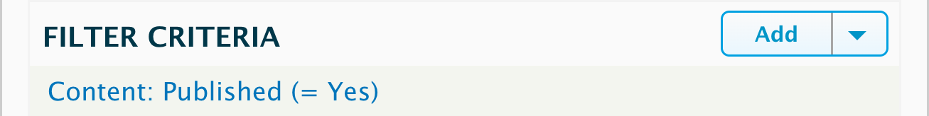
2. Next, select Translation Language and click Apply.

"Check box Translation Language, Content, The language of the content of translations."

3. Then, in the next pop-up, select Site’s default language, and click Apply again.

"In the pop-up, under Language, do not check Select all or Interface text language selected for page. Check the box for Site's default language (English)."

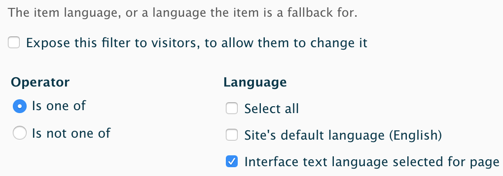
4. Back on the view edit page in the Language section, click on the setting underneath Rendering Language. 

"Language, Rendering Language: Interface text language selected for page"

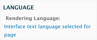
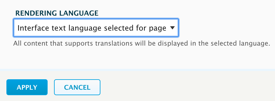
5. In the pop-up, change the select box to Interface text language selected for page and click Apply.

"Rendering Language, Interface text language selected for page, all content that supports translations will be displayed in the selected language. Apply"

6. Save your view!


This means that all the entities in your view will display in the requested language, but default to your default language so nothing gets left out. This filter also removes any duplicates, because the language is held constant during the query.

Keep in mind that if any entities in your view do not have a version in the default language, they will not show up, even if the page is set to the language they do have. This was not an issue for the example site as all the content started with English and was later translated, but this could create problems if your content is originating from multiple languages.


Indexed entity views

This was done using version 8.x-3.8 of the Search API Solr module. Since Search API Multilingual Solr Search was not merged into this module until 8.x-2.x, older versions of Search API Solr may not have this functionality (namely the “Language (with Fallback)” field which was added to fix this problem).

1. In the admin menu, go to Configuration > Search and metadata > Search API.

2. Edit the search index your view is pulling from and go to the Fields tab.

3. Click Add Fields.

"Manage fields for search index, Add fields"

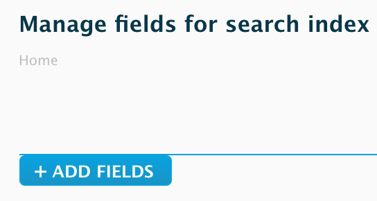
4. In this pop-up under Global fields, click Add next to Language (with Fallback).

"Language (with fallback), Add"

5. Save this configuration and re-index.

6. In your view’s filter criteria, add the Language (with Fallback) field and set it to Interface text language selected for page.

"The item language, or a language the item is a fallback for. Language, check interface text language selected for page."

Using multiple languages complicates everything in Drupal, but the Drupal community is always developing patches, updates, and modules to make it easier. If you have a multilingual Drupal website in need of custom solutions, see our contact page to get in touch!